I’ve been meaning to write this for ages – so long in fact, that a fair few people have beaten me to it, and covered the ground I would have…
… so I’ll run through the outstanding ones, mixed in with all sorts of hare-brained opinions of my own. The people I’m talking about here are proper designers. I’m a programmer who is occasionally forced to do design. Their word carries more authority than mine. All of the examples below make this site look like a shambles :) – I’ve actually done the redesign already, it’s just that it’s dependent on having a video… which I have yet to get around to making.

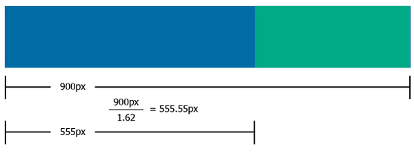
1) Nice detailed article by Jarel Remick over at net.tutsplus.com

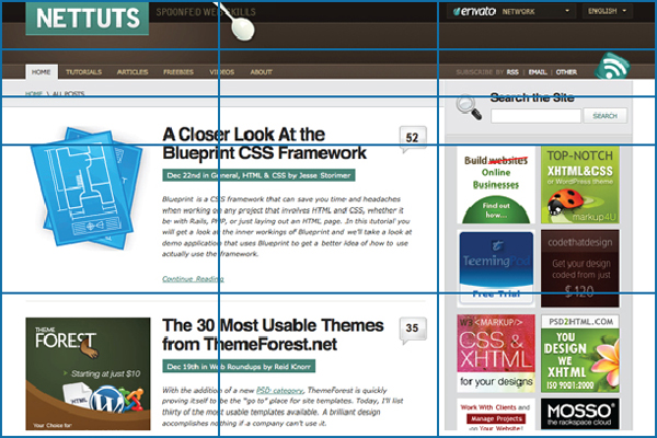
This gives a fairly good run-down of the structural makeup of a web-site – although although this is how the majority of web-sites “look”, and it is an evolved formula, so it’s probably got a lot going for it… I’m not so sure. Do you run Opera? (you should) – open Opera… then look at a site like spectrum.ieee.org or io9.com… both great sites (if you like that sort of thing)… but it’s actually easier to read their RSS feed as rendered by Opera than their actual site. Meantime sites like notcot.org or pinterest.com are gaining huge traction – presenting information in a similar way to the way Opera renders RSS.
So while I think using the golden mean is good for getting a balance between (and within) components of a web-page… I’m not sure that I’d want to be hemmed in by the same structure that 90% of the others use. And I’m sure Jarel would say exactly the same thing :) – as evidenced by the 3 column example in the image at the top of this page… which could just as easily be superimposed over a 3-equi-column layout… which is my preferred layout for index pages.
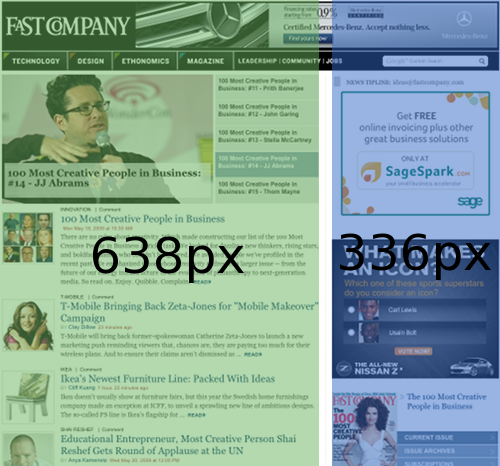
2) Brief overview from Matt Farina – using Fast Company as an example

3) Vitaly Friedman at Smashing Magazine takes a look at the golden mean – and the Rule Of Thirds (that photographers use)
Also provides such gems as the optimal content width is 60-80 characters a line. That I did not know.
Yea ok, I definitely need to redesign my own site then… although it is quite funny I suppose writing a piece about web design on such a badly-designed site*
4) Jake Rocheleau at Design Shack
Talks briefly (as did Jarel in 1) about the advantages of using this layout in fluid designs.
I have mixed thoughts about fluid designs tbh – there is now a proliferation of devices that people use to read the web… and there’s a sentiment among various designers that we should cater to this by converting absolute px values in CSS to %. They may be right… but as a lazy sod, who’s been doing this stuff since the beginning, this looks to me like another stick for web designers to beat themselves up with. Firstly there was Netscape 4 compatibility, then something else, then IE(5,6,7) compatibility… then the semantic web… and so on and so on. It gives web-devs a way of competing with each other I suppose, but places the entire compatibility burden on… us… and makes progress towards things like HTML5 etc a hell of a slow.
I’m almost inclined to say, “fuck it – make your hardware, or applications fit the software. Your experience may vary from device to device”… like film-makers do. Film-makers do not make films that are both 16:9 and 235:1 compatible… to achieve “cross-tv compatibility”. And people understand this.
Just a thought.
5) Steven Bradley at VanSeoDesign – nice look at the underlying mathematics, and lots of links to resources etc.
—
So there you go. Here’s a picture of my cat

You’ll notice immediately the lack of attention to proportion and layout… and yet… this is “from nature”. This is how he sleeps.
Nature doesn’t always conform to the golden mean herself.
And me?
Oh yea – I use the golden mean in web design all the time… usually to get a “2nd opinion” as to whether I’ve got things the right size… example here: http://tangerineworks.com/

I’m not sure if that’s very good :) – but I’m not a classically trained designer. I’m a programmer… and a web-inhabitant, who’s trying to escape from all-things-digital, by making physical things… like golden mean calipers. I sold 27 of them yesterday. I think it’s working.
* And I’ll tell you another thing… In my gradual migration from software to hardware, I’m finding myself buying stuff from sites that were clearly built back in the 90s, and never updated… all tables with borders set to 1px etc… and know what? It almost feels like these sites have more credibility than the really really slick ones. There is something inherently untrustworthy about polish… especially if it’s on a site that sells wing-nuts.
So polish itself is a type of communication – which sometimes mis-communicates.
Buy some calipers, you know you want to.